Friday, 24 June 2011
Saturday, 18 June 2011
Friday, 10 June 2011
Nigel Cabourn.
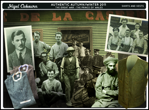
I recently discovered images of Nigel Cabourns inspiration boards and ideas sheets. It’s interesting to see what an established company uses in their research stages. Cabourn is infamous for only using materials and fabrics which he deems to be “authentic”. He is not interested in fashion per se, more the function and practicality of clothing.
The majority of his research and inspirations comes from war or vintage outdoor clothing. Sometimes he will re-make an old war jacket that he has found, but in a new and modern way – other times the garments he produces will be inspired by the necessity of something – for example a mountain climbing jacket, which has an obvious need for warmth.
Images from cabourn.com
When looking at his mood boards you can easily see what he is gaining from each one. They are just a bunch of random images thrown together, each one has been specifically chosen for a purpose. Be it from the fit of the trousers, to the buttons on the jackets or the stylings of the people wearing the clothes.
Looking at the garments Cabourn has produced you can clearly see where he takes his inspiration. He doesn’t pretend to be a revolutionist in fashion, instead prefers to add garments with a real heritage onto a new audience.
Thursday, 9 June 2011
Graduate Fashion Week 2011.
Graduate Fashion Week was a great opportunity to see what is expected from a student at the end of the three years. Looking through people’s portfolio’s and sketchbooks was a real eye opener about how much work you are expected to produce.
Overall the standard was really high, there was lots of work that I didn’t particularly like, but I could see it’s merit.
Earl’s Court II Exhibition Room.
Walking around the exhibition room it was obvious which colleges/universities have money. Some produced very thorough and detailed magazines, whilst some other places had smaller leaflets.
Everyone was trying to do that little bit more to get noticed. I realised that there wasn’t much of a focus on menswear. As someone who is mainly interested in menswear I can look at this in two ways. Firstly, there is less competition and so it may be slightly easier to have a more memorable collection. Secondly, there isn’t as much desire for menswear in the fashion industry so it may be more difficult to get going.
Obviously menswear has a place in the fashion industry, but how much smaller that place is is really rammed home at events such as this. I’m going to take this as a positive, as it means there is less chance for work to be produced which is very samey. What I mean by that is when I was walking around the exhibition room I noticed that lots of the work produced for women was basically done in the same way – there was a few eye-catching stand out pieces, but lots of it seemed to fit into a similar mould. It’s almost at the stage where women designing for women are ten a penny.
Edinburgh College of Art &
University of Central Lancashire Shows.
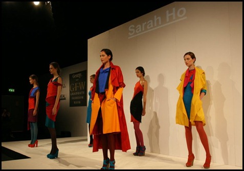
The two shows that I saw were from Edinburgh and Central Lancashire. Both shows were good, but the Edinburgh one seemed more professional.
The garments seemed to follow current trends which was a surprise, there was lots of colour-blocking and tailored garments.
It slightly daunting about how much work and effort had gone into each collection – and again showed just how much work is expected from a graduate student.
Interdisciplinary Processes.
Final Garment.
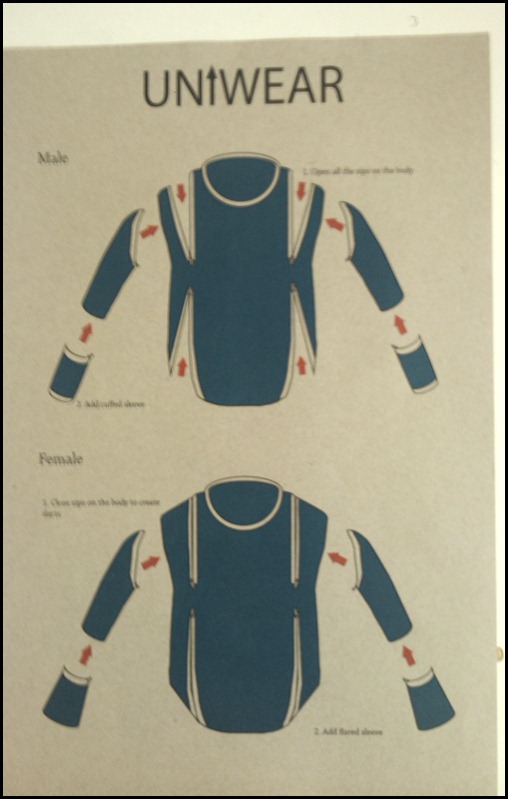
My final design is constructed around the concept of multi-use. The garment can be worn by both sexes in a number of different ways.
On the garment are various darts which can be opened and closed depending on the gender of the wearer. These darts provide bust when the garment is worn by women, and when opened give extra material and fit for males. To construct the pattern of the garment I combined both the male and female pattern blocks – ensuring the shoulders and the neck would be wide enough for all wearers.
To change the appearance of the garment the sleeves can be totally removed at both the shoulder and the elbow, different ones can be added. The male version of the sleeve has a cuff, whereas the female sleeve has flare.
Communications Portfolio.
For my Communications Portfolio I used Illustrator. I haven’t previously had a lot of experience but feel I learnt a lot through trial and error. I am very pleased with the outcome of my various pieces – I got the over all look that I set out to achieve (that of simple self assembly instructions manual).
Packaging; vacuum packed.
Fashion illustration in the style of an instructions manual.
Promotional Postcard; double sided, pieces are removed and stuck onto body.
Swing ticket; information card removed once purchased.
I am very happy with my outcome from this module – I feel my work was the most complete yet. I didn’t get too fixated on an idea too soon so was able to thoroughly explore my options and experiment with design.
The final garment is the best in terms of construction that I have done in the year. Whilst it is not something I, or most probably anyone else, would actually wear, it makes sense in relation to my original concept and brief title (Deconstruct/Reconstruct).


