Tuesday, 22 March 2011
Monday, 14 March 2011
Friday, 11 March 2011
Fabric Presentation Board.
Your Space A/W 11/12.
For our fabric presentation board we tried to incorporate the ethos behind ‘Your Space’ by housing all of the elements into a box and creating a micro-environment. This micro, hidden, environment also reflects the selected privacy of ‘Your Space’ – to build a barrier around yourself and hide.
Since ‘Your Space’ represents a clean, efficient look we painted the box white to remove all character and give an almost clinical look.
We decided to cut the name of the trend out of fabric at the bottom of the box – this was to convey the subtle nature of the trend, to not be too overbearing.
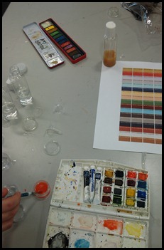
To make our colour palette more interesting visually, and to also reflect the clinical nature of ‘Your Space’, we added little bottle and tins filled with watercolours of the appropriate pantone colours.
Our fabric samples are a fairly broad in range. We have denim, felt, and wool and cotton mixes. Each fabric represents something different within the trend, for example the denim is sturdy, for multi-functional work-wear, and the punctured cotton displays the rows and precision associated with the trend.
Since ‘Your Space’ is about order and function we decided to set everything into rigid rows and columns – this is to be a clutter free environment.
Overall I’m fairly happy with how the final presentation board turned out. With this been group work it you obviously have to learn to compromise with your peers – this doesn’t look 100% how I imagined it would at the start, but you have to accept that when there are my than one mind adding to the creative process.


